

Press Kit Photography Guide for Better Coverage
A press kit can contain a sharp bio, a timely announcement, and a compelling story. But if the photos feel generic, outdated, or difficult to use, the kit loses momentum before anyone reads the second paragraph. Editors, producers, event programmers, and potential partners make quick visual judgments. The right images give them a clear reason to place you, feature you, and take your work seriously.
This press kit photography guide is built for founders, artists, executives, speakers, performers, and creative teams who need imagery that looks considered on a publication page, a conference website, or a producer’s pitch deck. The goal is not simply to collect attractive photos. It is to create a focused set of assets that makes public-facing opportunities easier to say yes to.
Start With the Story You Need the Images to Tell
Press photography works best when it supports a specific public identity. A startup founder announcing a funding round needs a different visual direction than a recording artist releasing new work. A chef opening a restaurant, a nonprofit leader stepping into a visible role, and an author promoting a book all have different audiences, settings, and reasons to be photographed.
Before choosing outfits or booking a studio, get clear on where the photos may appear. Think about press releases, online features, podcast guest announcements, speaker pages, award nominations, media interviews, social posts, and brand partnerships. This does not mean every image needs to serve every platform. It means the collection should give a media contact enough range to choose an image that fits their format.
A useful creative brief answers a few direct questions: What are you promoting? Who needs to recognize you? What should they understand about your style, authority, or point of view within a few seconds? A founder may want calm confidence and modern leadership. A performer may need more edge, movement, and atmosphere. A creative business may want its process and personality to feel visible, not hidden behind a corporate smile.
Build a Press Kit Photography Shot List With Range
A strong press kit is usually a small, intentional edit rather than fifty nearly identical portraits. You need options, but they should be distinct enough to solve different editorial needs.
Begin with a clean, current head-and-shoulders portrait. This is the dependable image for bylines, event pages, award programs, and quick announcements. It should be well lit, high resolution, and composed with enough open space that a designer can crop it for a vertical story, square post, or horizontal banner.
Then add an environmental portrait that puts you in a setting connected to your work. That could be your Oakland studio, office, creative workspace, restaurant, stage, or a Bay Area location with architectural character. The setting should add context without becoming visual noise. If it tells the audience something useful about your world, it belongs in the frame.
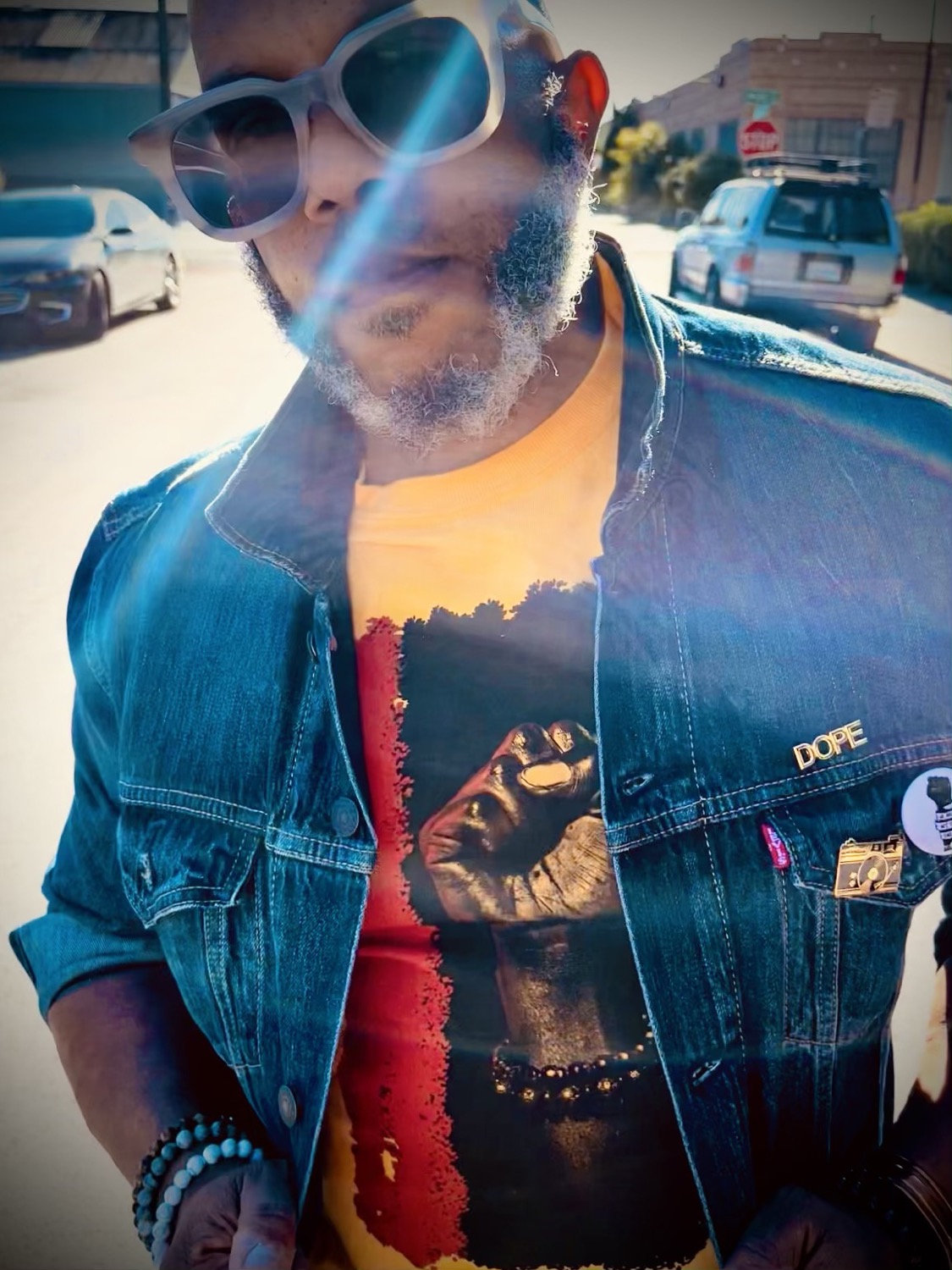
A third look can be more editorial. This is where wardrobe, light, color, texture, and expression can carry greater personality. It may be the image a magazine editor chooses for a feature because it feels less like a corporate profile and more like a point of view. For artists, fashion-forward professionals, and public figures, this image often becomes the one people remember.
If your work involves a product, team, performance, or process, include supporting images as well. A founder with their product, a designer at work, a chef in the kitchen, or a band in rehearsal can give a writer visual material beyond a single face. Use these strategically. They should feel polished enough for publication, not like casual behind-the-scenes content.
Choose Wardrobe That Reads Clearly on Camera
Your wardrobe should reinforce the role you are stepping into. The right choice is rarely about dressing as formally as possible. It is about looking like the most refined, recognizable version of yourself.
Solid colors and thoughtful texture tend to photograph well because they hold attention on the subject. Extremely small patterns, prominent logos, and overly reflective fabrics can be distracting under studio lights or in a tight crop. That does not mean your look must be neutral. A bold jacket, sculptural jewelry, sharp eyewear, or signature color can make an image feel ownable when it is aligned with your brand.
Bring two or three complete looks if the session allows. One can be direct and professional, another can feel more expressive, and a third can be relaxed or location-specific. Avoid treating wardrobe changes as an excuse to create unrelated identities. The images should all feel like they belong to the same person and moment in your career.
Hair, grooming, and makeup deserve the same planning. Camera-ready is not necessarily heavy or overdone. It means creating a finish that holds up under professional lighting and high-resolution detail. If you are presenting a team, set a simple wardrobe direction in advance so everyone looks coordinated without looking uniform.
Plan for How Editors Actually Use Images
An image can be beautifully shot and still be inconvenient for press if it is delivered without practical use in mind. Publications often need room for headlines, pull quotes, crops, or page layouts. That is why negative space matters. A frame with a little breathing room around the subject is often more valuable than a tightly composed portrait with nowhere for text to go.
Orientation matters too. Plan for vertical, horizontal, and square-friendly images. Vertical portraits work naturally for profiles and social placements. Horizontal frames are useful for website banners, articles, and presentation slides. A photographer can make these decisions during the session, but only if the purpose has been discussed early.
Keep the final edit current. A press photo should look like you now, not like a version of you from five years ago. Update your images after a meaningful visual change, a new leadership role, a major launch, or a shift in your creative direction. Consistency builds recognition, but outdated consistency works against you.
Prioritize Direction, Not Just a Good Camera
Most people are not used to standing in front of a lens while trying to look natural, credible, and interesting. That is normal. What separates an effective press session from a collection of stiff images is clear direction.
A photographer should help with posture, hand placement, angles, expression, movement, and the small adjustments that change how an image reads. The difference between approachable and uncertain can be a slight shift in shoulders, chin, or eye line. The difference between polished and flat can be the lighting choice, the styling, or the way a subject interacts with the environment.
This is especially valuable if you are leading a company or representing a public-facing brand. You do not need to perform a personality that is not yours. You do need images that make your presence legible. A calm executive can look decisive. A thoughtful artist can look magnetic. A creative entrepreneur can look both polished and original.
At MooD-ology Photography, that blend of commercial clarity and editorial portraiture is part of the approach. The session should produce usable media assets without sanding down the character that makes your work distinct.
Deliver Files That Are Easy to Use
After the session, organize your final selection so your publicist, assistant, communications team, or media contact can find the right file immediately. Confusing filenames and oversized folders create unnecessary friction when a deadline is tight.
Keep a folder with high-resolution files for print and larger placements, plus web-ready versions for online use. Name files clearly with your name or organization, a short description, and orientation when helpful. For example, “Jordan-Lee-Press-Portrait-Vertical” tells someone far more than “IMG_4827.”
Include a small mix of color and black-and-white only when both treatments add real value. Color usually offers more flexibility, while black-and-white can be powerful for a mood-driven editorial placement. Do not convert every photo just to create more files. Select the strongest images and make each one earn its place.
You should also keep a current photo credit line ready to share. It is a small professional detail, but it helps publications use the work correctly and keeps the process clean.
Know When a Headshot Is Not Enough
A standard headshot is essential, but it cannot always carry a full press campaign. If you are launching a product, releasing a body of work, announcing a major event, or repositioning your business, a broader branded editorial session is usually the smarter investment. It gives you the portrait, the context, and the visual range needed for ongoing promotion.
The trade-off is planning. A more layered shoot takes time for location selection, wardrobe, styling, and creative direction. But that preparation can give you months of consistent, elevated content instead of a single image that gets stretched across every channel.
Your press photos are often the first proof that you are ready for the room you want to enter. Make them current, intentional, and easy to publish. When the right opportunity arrives, you should not be searching your camera roll - you should be ready to send the image that belongs with your name.



Comments