

Authentic Brand Imagery Trends That Feel Real
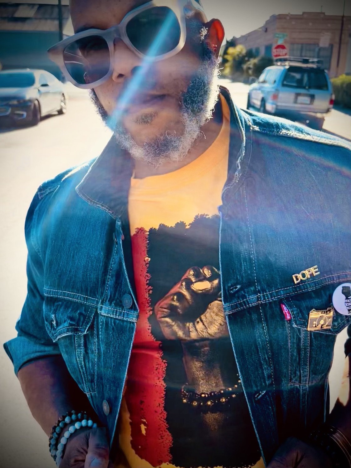
A polished headshot can earn a click. A photograph that shows how you think, work, and move through a room can earn trust. That distinction is driving authentic brand imagery trends: brands are trading generic visual perfection for images with point of view, context, and a recognizable human presence.
For entrepreneurs, executives, artists, and growing teams, this does not mean showing up unprepared or calling a blurry phone photo “real.” The strongest imagery still has intention. It simply leaves room for personality, texture, and the details that make your business feel like an actual business rather than a template.
Authentic Brand Imagery Trends Are More Directed, Not Less
Authenticity is often confused with spontaneity. They are not the same thing. A strong branding session can be highly art-directed while still feeling relaxed, immediate, and honest. In fact, direction is what keeps “candid” imagery from becoming visually flat or awkward.
The current shift is away from stiff, front-facing photographs where every person wears the same expression and every workspace looks untouched. Clients want to see a founder reviewing a sample, a consultant in conversation, a designer making decisions, or a creative professional in an environment that reflects their taste. The image should give the viewer something to read beyond a smile.
That requires preparation. Wardrobe, location, props, movement, and lighting all shape the story. The goal is not to manufacture a personality. It is to make the existing one visible.
The End of the Generic Office Look
For years, brand photography leaned hard on bright, neutral spaces, laptops, coffee cups, and carefully staged collaboration. Those visual cues still have a place, especially when a company needs broad commercial flexibility. But they are no longer enough to distinguish a brand with a clear point of view.
A financial advisor may benefit from a more restrained environment that signals discretion and focus. A stylist, architect, chef, or founder may need richer color, tactile surfaces, and a setting with more visual character. A Bay Area business can use its environment without leaning on predictable city backdrops. A street, studio, storefront, or workspace should add meaning, not merely announce a location.
The trade-off is usability. Highly specific images can be memorable, but a website also needs clean assets with room for text, straightforward profile images, and landscape crops for banners. The answer is not choosing one style over the other. It is planning a varied image library during the same session.
Show the Work, Not Just the Person
Personal branding photography remains essential, particularly for people whose expertise is the product. Still, audiences increasingly expect proof of process. They want to understand what engaging with you feels like.
That is why process imagery is becoming more valuable. Think less about posing beside a desk and more about the moments that define your service: reviewing a proposal, preparing for a client call, selecting materials, rehearsing, sketching, packing an order, or working through a detail with care. These photographs give a website, pitch deck, newsletter, and social feed more range than a set of portraits alone.
The work should be real enough to hold up to scrutiny. If you are photographing a consultation, use actual notes and materials. If you are showing a product, include the hands, tools, and decisions behind it. Viewers can sense when an activity has been staged without any connection to the business.
This does not mean every frame needs to be documentary. A photographer may adjust a chair, simplify a background, or ask you to repeat a movement for better light. That is normal. The difference is whether the scene still reflects something you genuinely do.
Movement creates credibility
Movement has become one of the most effective ways to make branding images feel less formal. Walking into a meeting, turning toward a client, arranging product, or simply shifting attention away from the camera can create a more natural rhythm.
Movement should have a reason, though. Random motion can look like filler. A good session uses gestures and actions connected to your work, then photographs them with enough compositional discipline to feel editorial rather than accidental.
Editorial Personality Is Replacing Safe Sameness
A brand can be approachable without being visually anonymous. One of the most useful authentic brand imagery trends is the return of editorial choices: intentional shadow, richer contrast, interesting crop decisions, statement wardrobe, and environments that carry mood.
This is especially relevant for creative professionals and personal brands competing in crowded feeds. The safest image is rarely the image people remember. A visually distinctive portrait can communicate authority faster than a page of polished copy, provided the style matches the person and the audience.
There is a line to manage. Fashion-forward styling and dramatic lighting can elevate an artist, performer, founder, or luxury service provider. For a corporate leader, those choices may need to be quieter. The image can still have dimension and confidence without becoming a character study that distracts from the role.
MooD-ology Photography approaches this balance through commercial-ready photography with an editorial eye. The result should work in practical places like LinkedIn, a press feature, or a website while retaining enough personality to feel owned rather than borrowed.
Real People Need Better Representation
Authenticity also means being specific about who appears in your images. Brands are moving away from relying exclusively on stock-style diversity or a single founder portrait repeated everywhere. Customers want to see the people who make the experience possible: team members, collaborators, clients when appropriate, and the communities a business genuinely serves.
Representation works best when it is built into the visual plan, not added as an afterthought. Photograph people as capable participants in the story, not as decorative proof of inclusion. Give them environments, wardrobe, and visual attention that feel consistent with the brand.
For teams, individual portraits matter. They do not need identical poses or flat lighting to look cohesive. Cohesion can come from a shared color palette, a common location, similar framing, or one lighting approach. Allowing each person some expression within that system often makes the full set more credible.
Imperfection Has a Limit
There is a growing appetite for images that feel less over-retouched. Skin texture, lived-in spaces, expressive laughter, and a little motion blur can make a brand feel present. But “unpolished” is not automatically authentic.
Poor light, cluttered backgrounds, distracted expressions, and inconsistent color treatment can dilute trust, particularly for businesses asking clients to invest significant money or confidence. This matters for professional services, hospitality, wellness, and any brand where the photograph acts as a first meeting.
The standard should be intentionality. Keep the texture. Remove the distraction. Preserve the personality. Refine what gets in the way of the message.
Consistency still builds recognition
A brand image library should not look like every photograph came from a different visual universe. When colors, editing, and energy shift wildly from post to post, even strong individual images lose collective impact.
Consistency does not require repetition. You can pair close portraits with wide environmental shots, quiet desk scenes with energetic motion, and clean studio work with location photography. What connects them is a stable visual point of view. That point of view makes it easier for someone to recognize your work before they read the caption.
Build for More Than One Platform
The most effective sessions are planned around where the images will live. A vertical portrait may be ideal for Instagram and speaking announcements but weak for a homepage banner. A horizontal working shot may carry a website beautifully but need alternate crops for social media. A headshot needs clarity at thumbnail size, while a press image may need negative space for publication layouts.
Before a session, identify the places your images must perform: website pages, LinkedIn, email, press, proposals, booking platforms, campaign graphics, and social content. Then photograph with those crops and uses in mind. This keeps the work strategic without draining it of creativity.
The most useful brand imagery does not try to prove that your business is perfect. It gives people a clear feeling that there is a real person, a real standard, and a distinct point of view behind the name. Let the images show enough of the work that the right clients can picture themselves in the experience.


Comments