

Headshot Wardrobe Color Choices That Photograph Well
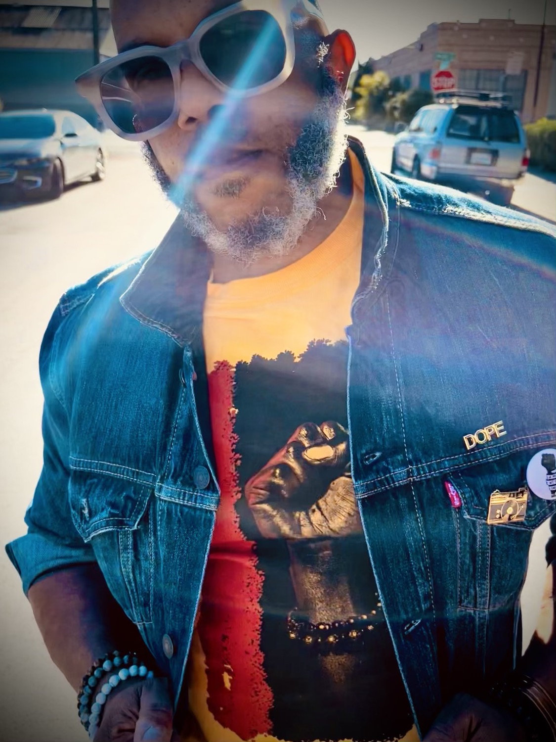
Your headshot is often seen before you are. On LinkedIn, a company site, a speaker bio, a casting profile, or an About page, color sets the tone in a split second. The best headshot wardrobe color choices do more than flatter your complexion. They support the level of confidence, creativity, authority, or warmth you want people to feel when they meet your image.
A great color does not need to be loud. It needs to feel intentional. The goal is a portrait where people notice your expression first, then absorb the visual message created by your clothing, styling, and background.
Start With the Message You Want to Send
Before choosing a shirt, blouse, jacket, or dress, consider where the headshot will live and what it needs to do for you. A startup founder may want to appear clear, current, and approachable. An attorney may prefer calm authority. A creative director, stylist, or performer may have more room for visual edge.
Your wardrobe color should match that positioning. Navy, charcoal, deep green, and rich burgundy often read as polished and grounded. Soft blue, muted lavender, warm taupe, and dusty rose can feel open and personable. Black can be striking and fashion-forward, but it can also read formal or severe when it is not balanced with expression, lighting, and texture.
There is no universal "best color" for a headshot. The right choice depends on your skin tone, hair color, the studio setup, your industry, and whether the final images need to work across several platforms. A color that looks incredible in person can become flat under certain lighting or disappear against a similar background.
Headshot Wardrobe Color Choices That Work on Camera
Solid, medium-to-deep colors are often the most reliable place to start. They create visual structure without competing with your face, and they tend to crop well for profile images. Think of colors with some depth: cobalt, forest green, teal, plum, rust, wine, sapphire, or a true medium blue.
Jewel tones are a strong choice for many people because they bring richness without requiring a bright, highlighter-level color. Emerald, royal blue, deep teal, and cranberry can look especially clean in studio portraits. They photograph with presence while keeping attention where it belongs.
Earth tones can be equally effective, especially for brands that want an organic, grounded, or design-forward feel. Olive, camel, chocolate, terracotta, and warm cream can look refined and modern. The trade-off is contrast. If your complexion is warm or deep, choose an earth tone that is clearly lighter or darker than your skin so the image retains definition.
Neutrals deserve more credit than they get. Navy is a headshot staple because it is professional without feeling as rigid as black. Charcoal offers a softer alternative to black, while cream and off-white can create a fresh, elevated look. Pure white can work beautifully, but it needs thoughtful lighting and styling. It can photograph very bright, pull attention upward, or lose detail if the exposure is not controlled.
Choose Contrast, Not Just a Favorite Color
The strongest wardrobe decisions create enough separation between you and what is around you. This matters more than following a color rule pulled from a generic style chart.
If you have dark hair and wear a dark top against a dark backdrop, your portrait may look sleek and dramatic, but the silhouette can blend together. That may be exactly right for a fashion-led editorial image. For a corporate headshot, adding a lighter shirt, neckline, jacket texture, or intentional rim lighting can create more separation.
The same principle applies to lighter hair and pale clothing. A light cream top can be beautiful, but if the background is also light, the image can feel washed out without enough contrast in makeup, accessories, or tailoring. Your photographer can guide the setup, but bringing options gives the session more range.
A quick test helps: hold the garment near your face in daylight and take a simple phone photo. Does your skin look alive? Are your eyes still the focal point? Or does the color make you look tired, gray, overly red, or faded? Your reaction will often tell you more than a trend report.
Colors That Can Be Tricky
Bright neon shades are difficult because they can reflect colored light onto the skin, particularly around the jawline and neck. Very saturated red can be powerful, but it usually becomes the most dominant element in the frame. That is useful when boldness is part of the brand, less useful when you need a versatile executive portrait.
Tiny checks, pinstripes, herringbone, and small high-contrast prints can create visual vibration on camera. Large prints can be equally distracting if the crop catches only part of the pattern. If you love pattern, choose one with a larger scale, low contrast, and a color story that still lets your face lead.
Avoid choosing a color solely because it is considered universally flattering. If deep purple makes you feel unlike yourself, it will show in your posture. A headshot should look like your strongest, most intentional self, not a version styled for an imaginary audience.
Match Your Colors to Your Professional Brand
For job seekers and corporate professionals, a navy, charcoal, medium blue, soft green, or warm neutral is usually a smart foundation. These colors travel well across LinkedIn, internal directories, press mentions, and company websites. Add personality through a tailored cut, a textured fabric, or a second wardrobe option rather than relying on a loud pattern.
For entrepreneurs, consultants, and personal brands, color can carry more of the story. A leadership coach may use deep blue to signal trust and clarity. A wellness founder might lean into sage, clay, or warm ivory. A creative business owner may look right at home in saturated green, mustard, cobalt, or an artful monochrome look. The question is not whether the color is trendy. It is whether it looks credible next to your work.
For actors, performers, and fashion-forward creatives, bring one reliable option and one with more point of view. Your clean, classic look covers the practical need. Your bolder look makes room for personality. In a guided session, this gives you images that can move between casting, portfolio, social, and editorial use.
At MooD-ology Photography, that balance matters. A headshot can be commercially useful and visually distinctive at the same time. You do not have to choose between looking professional and looking like yourself.
Build an Outfit Around the Neckline
Color gets the attention, but the neckline frames your face. A structured collar, crew neck, V-neck, open collar, or simple scoop neckline can each shift the image. Choose the shape that feels natural on you and does not require constant adjustment.
A blazer or jacket can add authority and definition, especially in a tighter head-and-shoulders crop. It also lets you create two looks quickly: jacket on for polish, jacket off for a more relaxed image. Keep the layer in a complementary color, not necessarily the same color as the shirt beneath it.
Accessories should be edited. Small jewelry, a signature watch, or glasses can add character, but only if they feel like part of your real presence. Avoid anything that reflects heavily, rattles, or pulls focus from your eyes. If you wear glasses every day, wear them in your headshot. Just bring a clean pair and let the photographer manage reflections.
Bring Options, Then Let the Camera Decide
Bring two or three complete looks rather than five unrelated pieces. Include one dependable professional option, one color that makes you feel especially sharp, and one alternate layer if it fits your goals. Steam or press everything before arriving. Wrinkles show more clearly than people expect, particularly on smooth fabrics and light colors.
Consider the practical details, too. A Bay Area tech headshot may call for understated polish, while a founder portrait for a creative studio can support more visual character. If you are photographing for a company with a strict brand palette, use it carefully. Wearing the exact company color is not always necessary. A nearby tone can feel more natural while still fitting the brand ecosystem.
The right wardrobe color should make getting photographed easier, not more stressful. Wear the shade that sharpens your presence, supports the room you want to enter, and lets your face do the work. When you look at the final image, you should recognize yourself immediately, just with the volume turned up.


Comments